
By now, more than 44% of the world’s population has shopped online at some point in their life. Ecommerce is more than firmly mainstream now and is showing no signs of slowing.
As the number of products offered online grows and the number of people shopping in front of a screen expands, the competition to get stuff sold online will intensify. That’s the issue with markets that grow too rapidly and have extremely low barriers to entry.
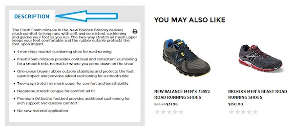
So how do you make your product page stand out from the nearly millions of others out there? Well, there are a few ways you can adjust your page’s UX elements and get visitors to buy. Here’s what you need to know:
Product Name – Make it Stand Out in Search

Let’s start with the obvious and get it firmly out of the way. The product name is the most useful aspect of your product page and the customer will, of course, use it to see if what they’re looking at is what they need. But the product name needs to do more than simply inform the visitor.
Think of the product name as a short sentence that describes the product. So instead of a short name, try putting some unique details into the title itself. This means people who copy-paste the name onto Google and try to look for the same thing cheaper elsewhere (cheeky, I know) will see your product listing first.
Effective Product Headlines – Influence the Buying Decision
People buy things because they make snap, emotional decisions or are rationally thinking about the purchase. There’s no way for you to know what sort of decision your visitors are going to make so you might as well appeal to both aspects. Your product headline needs to be both emotionally connective and rationally appealing.
Price – Get it Right to Attract Visitors

Here’s where you get a chance to appeal to the rational buyer online. Take some time to get your product pricing strategy right, but also make an effort to place the price in the right spot on the page. As a rule of thumb, place the price front and center if you are confident your prices are undercutting competitors. Place great emphasis on product price, like displaying 2 prices – one provided by other vendors and second your own discounted price. If you aren’t competing solely on price, place the price at the end of a long list of all the amazing benefits and features of the product.
Product Photos – High resolution and Multi-angle

The one element that probably takes up more space on a product page than any other is the main image. Product photos need to be high quality and capture a whole range of different angles. Make the images effective and attractive so it ‘sells’ the product. The more images and the better the quality, the more likely you are to clinch a deal. This is your opportunity to do two very important things – make a great impression and give information.
You can create excitement about the product regardless of what it is by getting a professional photographer to shoot amazing shots of the product. Flatter the image like it is the headliner at a music event. Putting the product in the spotlight is what helped Steve Jobs sell Apple products like hot cakes. Want to know what Apple did to make the product pop? Simply remove the background. You can do that too and make the product stand out on a white page.
Another reason you need a lot of pictures is to convey information. If you have certain plugs that fit a TV, it makes sense to take a photo of the back and post it online. If you sell garments, you need a picture of someone wearing it as well as a plain photo of the shirt by itself.
A great product photo gallery will let you form a connection with the emotional and rational sides of a user. Online shoppers can be sceptical, earn their trust by showing them as much of the product as possible.
Add to Cart – Make the CTA Stand Out

One click and you have the customer’s intent to buy the product. This is why you need to make this element really easy to use. The button needs to be easy to spot and big enough to press, so use the squint test to see if the button is visible even when you are squinting your eyes. If it isn’t, enlarge the button and slap on a better color.
Delivery Options

One of the biggest reasons people abandon what’s in their baskets is because they don’t have all the information about delivery. Tell your customers how much it will cost to deliver, what slots are available and whether you ship internationally. All these details should be displayed in delivery option to eliminate basket abandonment.
Awesome article! I found here too many amazing ways to Product Pages Setup. Thanks for providing this information!
ВідповістиВидалити